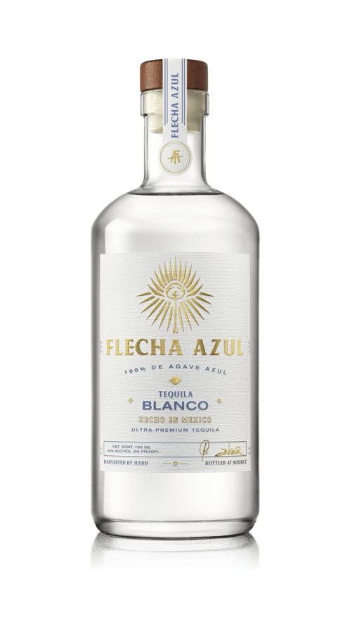
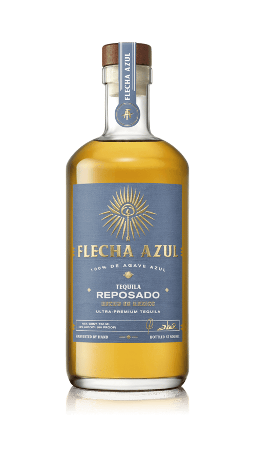
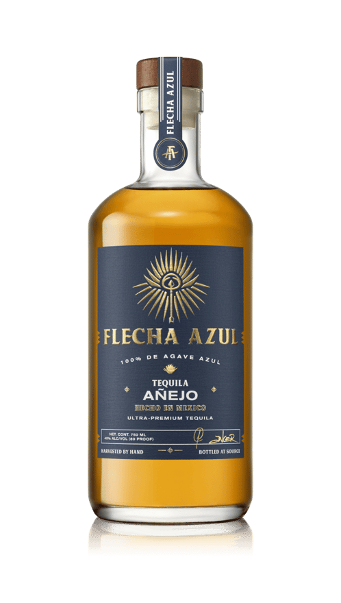
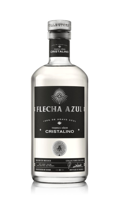
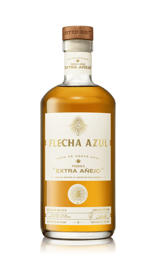
We drew inspiration for our logo and branding from centuries of history and heritage rooted in Mexico and tequila. The logo is a reflection of the Mexican culture and symbolizes strength, pride, tradition, and perseverance.
The word “Flecha” translates to “arrow” in English. An arrow is a sign of perseverance; it can only move forward once the continued tension pulling back is released. To hit its target, the arrow must be aimed high. This holds true to the humble beginnings of our founders. Just like the arrow, they aimed high, despite all pullbacks to launch their paths to success. At the center of the Flecha Azul Tequila logo is an arrow.
The arrow is subtly placed inside of the symbol of strength, the coa. Used by Jimadores, highly-skilled Mexican farmers, the coa is a quintessential tool used to harvest the Pina (the core of Blue Weber Agave). Jimadores spend hours hand cutting each individual leaf from every plant. This process is both time and labor-intensive and requires incredible skill and strength to harvest the agave.
The word “Azul” translates to “Blue”, a nod to the quality of agave used in making the product. Made from 100% Blue Weber Agave, this ultra-premium product is made from the finest agave in the world. This can be seen in the color of the arrow within the logo, and the leaves that encircle the center.
Surrounding the arrow and coa are dozens of Blue Weber Agave leaves. The leaves are strategically placed to look like a burst of light behind the coa and arrow. A symbol of energy like the bright and vibrant culture of the people of Mexico. A symbol of life that the light gives to the fields of Jalisco, Mexico. A symbol of purity in that Flecha Azul Tequila is tequila in its most natural and truest form.

